xkcd is a popular webcomic created by randall munroe. here, we will show how to create xkcd-styled r plots using the xkcd package, which provides a set of ggplot2 functions for plotting data in an xkcd style.
note: if R is not installed on your system, you can download and install a precompiled binary distribution here. to get started, load up r and then install the xkcd package:
to install the fonts on linux:
creating xkcd-styled scatterplots
we will use the mtcars dataset, which comprises fuel consumption and 10 aspects of automobile design and performance for 32 automobiles.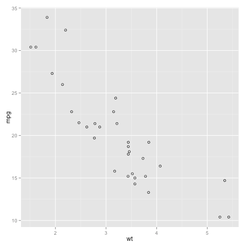
to create an xkcd-stylized scatterplot: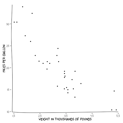
creating xkcd-styled bar and line graphs
to create a a basic bar or line graph using the mtcars dataset: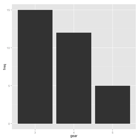
to create an xkcd-stylized bar or line plot: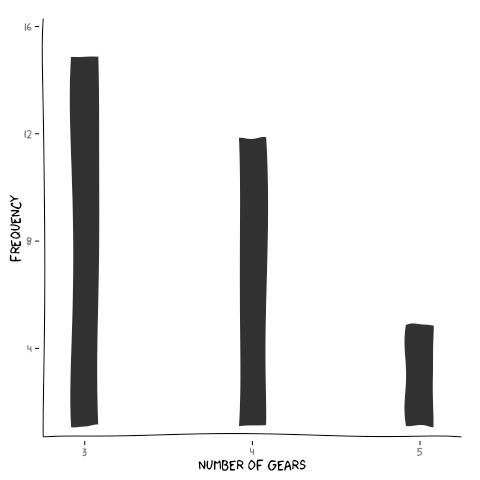
creating xkcd-styled pie plots
to create a basic pie plot using a mock dataset: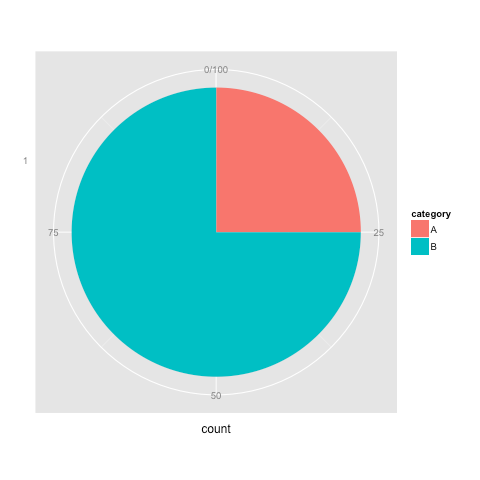
to create an xkcd-stylized pie plot: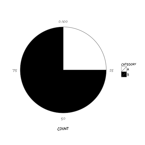
creating xkcd-styled histograms and density plots
to create a basic histogram using ggplot: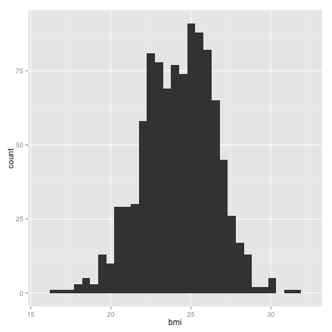

although there is no histogram function in the xkcd package, we can (kind of) create one like so: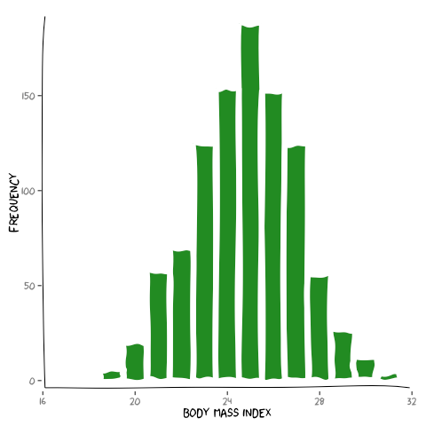
draw a man!
last but not least~!: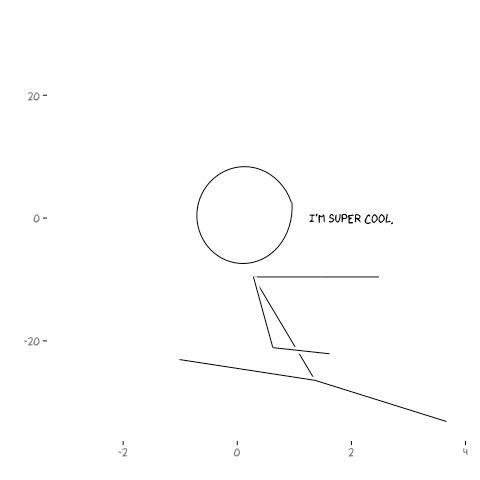

note: if R is not installed on your system, you can download and install a precompiled binary distribution here. to get started, load up r and then install the xkcd package:
install.packages("xkcd", dependencies=T) once the package has been installed, you can load the package by typing: library(xkcd)next, we need to install two additional fonts.
to install the fonts on linux:
library(sysfonts)to install the fonts on mac:
system("mkdir -p ~/.fonts")
download.file("http://simonsoftware.se/other/xkcd.ttf", dest="~/.fonts/xkcd.ttf", mode="wb")
download.file("http://dl.dropbox.com/u/12305244/Humor-Sans.ttf", dest="~/.fonts/Humor-Sans.ttf", mode="wb")
font.paths("~/.fonts")
font.add("xkcd", regular = "xkcd.ttf")
font.add("Humor Sans", regular = "Humor-Sans.ttf")
library(sysfonts)close and restart R.
download.file("http://simonsoftware.se/other/xkcd.ttf", dest="~/Library/Fonts/xkcd.ttf", mode="wb")
download.file("http://dl.dropbox.com/u/12305244/Humor-Sans.ttf", dest="~/Library/Fonts/Humor-Sans.ttf", mode="wb")
font.add("xkcd", regular = "xkcd.ttf")
font.add("Humor Sans", regular = "Humor-Sans.ttf")
creating xkcd-styled scatterplots
we will use the mtcars dataset, which comprises fuel consumption and 10 aspects of automobile design and performance for 32 automobiles.
attach(mtcars)to create a a basic scatterplot using ggplot:
head(mtcars)
# mpg cyl disp hp drat wt qsec vs am gear carb
#Mazda RX4 21.0 6 160 110 3.90 2.620 16.46 0 1 4 4
#Mazda RX4 Wag 21.0 6 160 110 3.90 2.875 17.02 0 1 4 4
#Datsun 710 22.8 4 108 93 3.85 2.320 18.61 1 1 4 1
#Hornet 4 Drive 21.4 6 258 110 3.08 3.215 19.44 1 0 3 1
#Hornet Sportabout 18.7 8 360 175 3.15 3.440 17.02 0 0 3 2
#Valiant 18.1 6 225 105 2.76 3.460 20.22 1 0 3 1
 library(ggplot2)
p <- ggplot(data=mtcars, aes(x=wt, y=mpg)) +
    geom_point(shape=1)                                                 # use hollow circles
print(p)
to create an xkcd-stylized scatterplot:
library(xkcd)
xrange <- range(mtcars$wt)
yrange <- range(mtcars$mpg)
p1 <- ggplot(data=mtcars, aes(x=wt, y=mpg)) +
geom_point(shape=20) + # use solid circles
xkcdaxis(xrange,yrange) + # plot the xkcd-styled axis
xlab("weight in thoushands of pounds") + # label the x-axis
ylab("miles per gallon") # label the y-axis
print(p1)
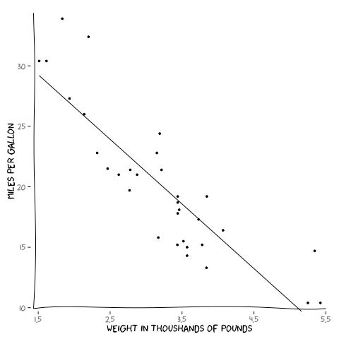
p2 <- ggplot(data=mtcars, aes(x=wt, y=mpg)) +
geom_point(shape=20) +
xkcdaxis(xrange,yrange) +
geom_smooth(method=lm, # add linear regression line
color="black", # color the line black
se=FALSE) + # turn off shaded confidence region
xlab("weight in thoushands of pounds") +
ylab("miles per gallon")
print(p2)
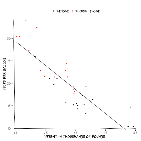
p3 <- ggplot(data=mtcars, aes(x=wt, y=mpg)) +
geom_point(shape=20,
aes(color=as.character(vs))) + # color whether engine is v or straight
xkcdaxis(xrange,yrange) +
geom_smooth(method=lm,
color="black",
se=FALSE) +
xlab("weight in thoushands of pounds") +
ylab("miles per gallon") +
theme(legend.position="top", # move legend to top
legend.title=element_blank()) + # remove legend title
scale_colour_manual(values = c("black", "red"), # set legend colors
labels=c("v-engine", "straight engine")) # change legend labels
print(p3)
creating xkcd-styled bar and line graphs
to create a a basic bar or line graph using the mtcars dataset:
library(ggplot2)
attach(mtcars)
counts <- table(gear) # count the number of cars per gear
df <- as.data.frame.table(counts, # convert the count table to a dataframe
responseName = "freq")
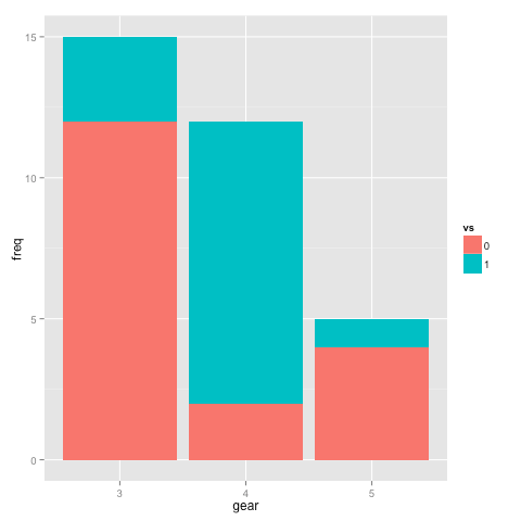
df1 <- as.data.frame.table(table(vs, gear), # create a dataframe of car by gears and engine type
responseName = "freq")
# basic bar graph
p1 <- ggplot(data=df, aes(x=gear, y=freq)) +
geom_bar(stat="identity")
print(p1)
# basic 2-variable bar graph
p2 <- ggplot(data=df1, aes(x=gear, y=freq, fill=vs)) +
geom_bar(stat="identity")
print(p2)
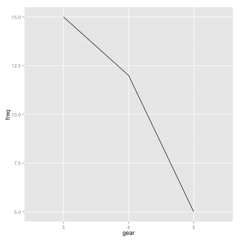
# basic line graph
p3 <- ggplot(data=df, aes(x=gear, y=freq, group=1)) +
geom_line()
print(p3)
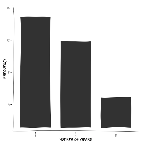
to create an xkcd-stylized bar or line plot:
# bar graph
df$xmin <- as.numeric(df$gear) - 0.1 # where each bar should start on the x-axis
df$xmax <- as.numeric(df$gear) + 0.1 # where each bar should end on the x-axis
df$ymin <- 1 # where each bar should start on the y-axis
df$ymax <- df$freq # where each bar should end on the y-axis
xrange <- range(min(df$xmin) - 0.1, # specify the range of the x-axis
max(df$xmax) + 0.1)
yrange <- range(min(df$ymin), # specify the range of the y-axis
max(df$ymax) + 1)
mapping <- aes(xmin=xmin,ymin=ymin,xmax=xmax,ymax=ymax)
p1 <- ggplot(data=df, aes(x=gear, y=freq)) +
xkcdrect(mapping,df) + # xkcd function to plot the bar shapes
xkcdaxis(xrange,yrange) +
xlab("number of gears") +
ylab("frequency") +
scale_x_discrete(labels=c(as.character(df$gear)))
print(p1)
df$xmin <- as.numeric(df$gear) - 0.4 # make the bars wider
df$xmax <- as.numeric(df$gear) + 0.4 # make the bars wider
df$ymin <- 1
df$ymax <- df$freq
xrange <- range(min(df$xmin) - 0.1,
max(df$xmax) + 0.1)
yrange <- range(min(df$ymin),
max(df$ymax) + 1)
mapping <- aes(xmin=xmin,ymin=ymin,xmax=xmax,ymax=ymax)
p2 <- ggplot(data=df, aes(x=gear, y=freq)) +
xkcdrect(mapping,df) +
xkcdaxis(xrange,yrange) +
xlab("number of gears") +
ylab("frequency") +
scale_x_discrete(labels=c(as.character(df$gear)))
print(p2)
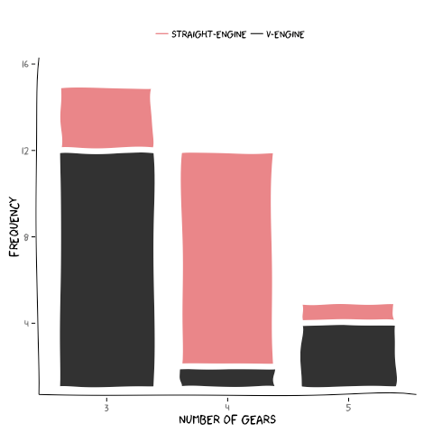
# 2-variable bar graph
vs0 <- subset(df1, vs=="0") # subset the df1 dataframe to include only vs=0
vs1 <- subset(df1, vs=="1") # subset the df1 dataframe to include only vs=1
vs0$xmin <- as.numeric(vs0$gear) - 0.4
vs0$xmax <- as.numeric(vs0$gear) + 0.4
vs0$ymin <- 0
vs0$ymax <- 0
vs0[vs0$vs=="0", ]$ymin <- 1
vs0[vs0$vs=="0", ]$ymax <- vs0[vs0$vs=="0", ]$freq
vs1$xmin <- as.numeric(vs1$gear) - 0.4
vs1$xmax <- as.numeric(vs1$gear) + 0.4
vs1$ymin <- 0
vs1$ymax <- 0
vs1[vs1$vs=="1", ]$ymin <- vs0[vs0$vs=="0", ]$freq
vs1[vs1$vs=="1", ]$ymax <- vs1[vs1$vs=="1", ]$freq + vs0[vs0$vs=="0", ]$freq
xrange <- range(min(rbind(vs0, vs1)$xmin) - 0.1,
max(rbind(vs0, vs1)$xmax) + 0.1)
yrange <- range(min(rbind(vs0, vs1)$ymin),
max(rbind(vs0, vs1)$ymax) + 1)
mapping <- aes(xmin=xmin,ymin=ymin,xmax=xmax,ymax=ymax)
p3 <- ggplot(data=vs0, aes(x=gear, y=freq)) +
xkcdrect(mapping,vs0, size=1.8) + # the size controls the distance jitter
xkcdaxis(xrange,yrange) + # and therefore the separation between the v0 and v1 bars
xlab("number of gears") +
ylab("frequency") +
geom_line(aes(0, 0, color="v-engine")) +
scale_x_discrete(labels=c(as.character(vs1$gear))) +
theme(legend.position="top", # move legend to top
legend.title=element_blank()) # remove legend title
p3 <- p3 + xkcdrect(mapping,vs1,fill="#EA8689") +
geom_line(aes(0, 0, color="straight-engine")) +
scale_color_manual(values=c("v-engine"="grey20", "straight-engine"="#EA8689"))
print(p3)
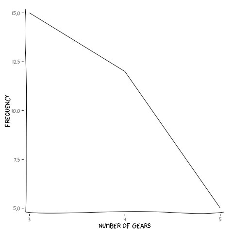
# line graph
xrange <- range(1:length(df$gear))
yrange <- range(df$freq)
p4 <- ggplot(data=df, aes(x=gear, y=freq, group=1)) +
geom_line() +
xkcdaxis(xrange,yrange) +
xlab("number of gears") +
ylab("frequency")
print(p4)
creating xkcd-styled pie plots
to create a basic pie plot using a mock dataset:
df = data.frame(count=c(25, 75),
category=c("A", "B"))
# basic pie chart
p1 <- ggplot(df, aes(x = factor(1), fill = category, weight=count)) +
geom_bar(width = 1) +
coord_polar(theta="y") +
scale_x_discrete("") + # remove y label
theme(axis.ticks = element_blank(), # remove tick marks
axis.text.y = element_blank()) # remove y axis marks
print(p1)
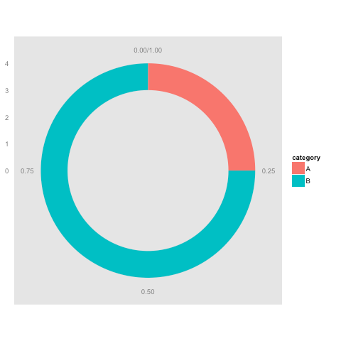
# donut chart
df$fraction = df$count / sum(df$count) # create fraction column
df = df[order(df$fraction), ] # sort dataframe by fraction
df$ymax = cumsum(df$fraction) # set end for each fraction
df$ymin = c(0, head(df$ymax, n=-1)) # set start for each fraction
p2 <- ggplot(df, aes(fill=category, ymax=ymax, ymin=ymin, xmax=4, xmin=3)) +
geom_rect() +
coord_polar(theta="y") +
xlim(c(0, 4)) +
theme(panel.grid=element_blank()) + # remove grid from plot
theme(axis.ticks=element_blank())
print(p2)
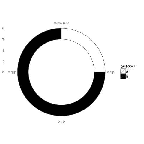
to create an xkcd-stylized pie plot:
 # xkcd pie chart
p1 <- ggplot(df, aes(x = factor(1), fill = category, weight=count)) +
        geom_bar(width = 1, colour="grey30") +
                                                     coord_polar(theta="y") +
                            scale_x_discrete("") +
          theme_xkcd() +                                                                                  # use the xkcd theme
                                                                                                                                                                                                                                                    theme(axis.ticks = element_blank(),
                                                                                                        axis.text.y = element_blank()) +
        theme(axis.text = element_text(family = "Humor Sans")) +
        scale_fill_manual(values=c("white", "black"))
                                                                      print(p1)

# xkcd donut chart
df$fraction = df$count / sum(df$count)
df = df[order(df$fraction), ]
df$ymax = cumsum(df$fraction)
                                                                    df$ymin = c(0, head(df$ymax, n=-1))
p2 <- ggplot(df, aes(fill=category, ymax=ymax, ymin=ymin, xmax=4, xmin=3)) +
     geom_rect(colour="grey30") +
     coord_polar(theta="y") +
     xlim(c(0, 4)) +
     theme_xkcd() +
         theme(panel.grid=element_blank(),
                 axis.ticks=element_blank()) +
         scale_fill_manual(values=c("white", "black")) +
         theme(axis.text = element_text(family = "Humor Sans"))
print(p2)
creating xkcd-styled histograms and density plots
to create a basic histogram using ggplot:
bmi <- rnorm(n=1000, m=24.2, sd=2.2)
histinfo <- hist(bmi, plot=F)
# basic frequency histogram
p1 <- ggplot(as.data.frame(bmi), aes(x=bmi)) +
geom_histogram(breaks=c(seq(15, 31)))
print(p1)
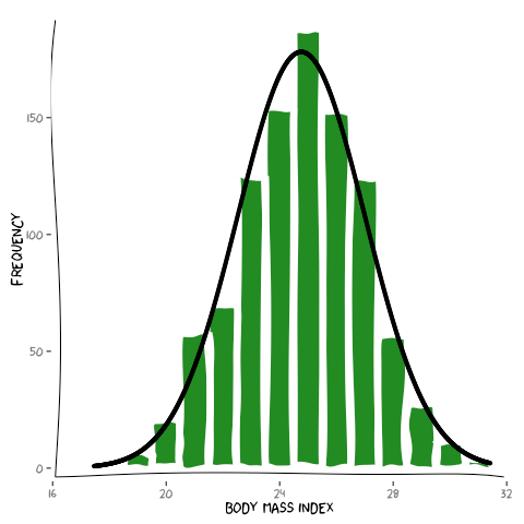
# with normal curve
p2 <- ggplot(as.data.frame(bmi), aes(x=bmi)) +
geom_histogram(breaks=c(seq(15, 31))) +
stat_function(fun=function(x, mean, sd, n){ n * dnorm(x = x, mean = mean, sd = sd) },
args = with(as.data.frame(bmi),
c(mean = mean(as.data.frame(bmi)$bmi),
sd = sd(as.data.frame(bmi)$bmi),
n = length(as.data.frame(bmi)$bmi))))
print(p2)
# density plot
p3 <- ggplot(as.data.frame(bmi), aes(x=bmi)) +
geom_density()
print(p3)
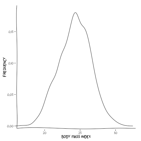
although there is no histogram function in the xkcd package, we can (kind of) create one like so:
# histogram
data <- data.frame(freq=1:length(histinfo$counts))
data$freq <- histinfo$counts
data$xmin <- histinfo$mids
data$xmax <- data$xmin + 1.0
data$ymin <- 0
data$ymax <- data$freq
xrange <- range(min(data$xmin) - 0.1, max(data$xmax) + 0.1)
yrange <- range(min(data$ymin), max(data$ymax) )
mapping <- aes(xmin=xmin,ymin=ymin,xmax=xmax,ymax=ymax)
p1 <- ggplot() +
xkcdrect(mapping,data,fill="forestgreen") +
xkcdaxis(xrange,yrange) +
xlab("body mass index") +
ylab("frequency")
print(p1)
# with normal curve
data <- data.frame(freq=1:length(histinfo$counts))
data$freq <- histinfo$counts
data$xmin <- histinfo$mids
data$xmax <- data$xmin + 1.0
data$ymin <- 0
data$ymax <- data$freq
xrange <- range(min(data$xmin) - 0.1, max(data$xmax) + 0.1)
yrange <- range(min(data$ymin), max(data$ymax) )
mapping <- aes(xmin=xmin,ymin=ymin,xmax=xmax,ymax=ymax)
xfit<-seq(min(bmi),max(bmi),length=length(bmi))
yfit<-dnorm(xfit,mean=mean(bmi),sd=sd(bmi))
yfit <- yfit*diff(histinfo$mids[1:2])*length(bmi)
normfit <- data.frame(x = c(xfit), y = c(yfit))
p2 <- ggplot() +
xkcdrect(mapping,data,fill="forestgreen") +
xkcdaxis(xrange,yrange) +
xlab("body mass index") +
ylab("frequency") +
geom_point(data = normfit,
aes(x=x+0.5, y=y))
print(p2)
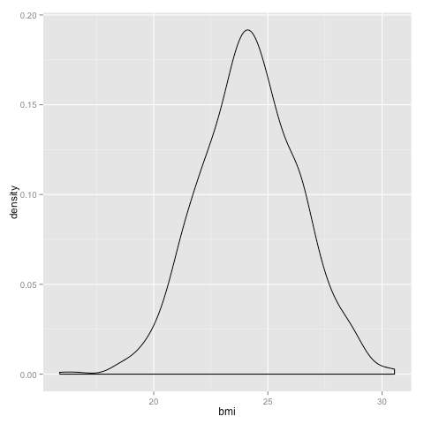
# density plot
d <- density(bmi)
data <- data.frame(mids=1:length(d$x), density=1:length(d$y))
data$x <- d$x
data$y <- d$y
xrange <- range(data$x)
yrange <- range(data$y)
p3 <- ggplot() +
geom_line(data = data,
aes(x=x, y=y)) +
xkcdaxis(xrange,yrange) +
xlab("body mass index") +
ylab("frequency")
print(p3)
draw a man!
last but not least~!:
datascaled <- data.frame(x=c(-3,3),y=c(-30,30))
xrange <- range(datascaled$x)
yrange <- range(datascaled$y)
ratioxy <- diff(xrange) / diff(yrange)
mapping <- aes(x=x,
y=y,
scale=scale,
ratioxy=ratioxy,
angleofspine = angleofspine,
anglerighthumerus = anglerighthumerus,
anglelefthumerus = anglelefthumerus,
anglerightradius = anglerightradius,
angleleftradius = angleleftradius,
anglerightleg = anglerightleg,
angleleftleg = angleleftleg,
angleofneck = angleofneck)
dataman <- data.frame( x= c(0), y=c(0), # x,y position of center of head
scale = c(20), # size of man in units of Y axis
ratioxy = ratioxy, # ratio x to y of graph
angleofspine = -1, # angle of spine
anglerighthumerus = 0, # angle of right humerus
anglelefthumerus = 5, # angle of left humerus
anglerightradius = 0, # angle of right radius
angleleftradius = -0.1, # angle of left radius
angleleftleg = 6, # angle of left leg
anglerightleg = 3, # angle of right left
angleofneck = 5) # angle of neck
p <- ggplot(data=datascaled, aes(x=x,y=y)) +
geom_point(color="white") +
xkcdman(mapping,dataman) +
theme_xkcd() +
annotate("text", x=2, y = 0, label = "I'm super cool.", family="xkcd") +
xlab("") + ylab("")
print(p)
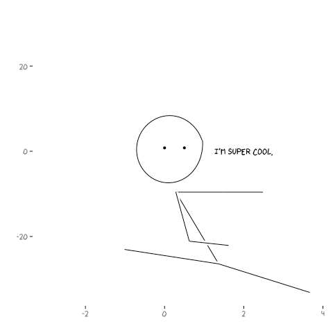
# to add eyes (because why not)
eyes <- data.frame(x=c(0, 0.5),y=c(0.8, 0.8))
p <- p + geom_point(data=eyes, aes(x=x, y=y), color="black")
print(p)
# and now a mouth
mouth <- data.frame(x=c(0.2, 0.3),y=c(-5, -5))
p <- p + geom_line(data=mouth, aes(x=x, y=y), color="black")
print(p)
 RSS Feed